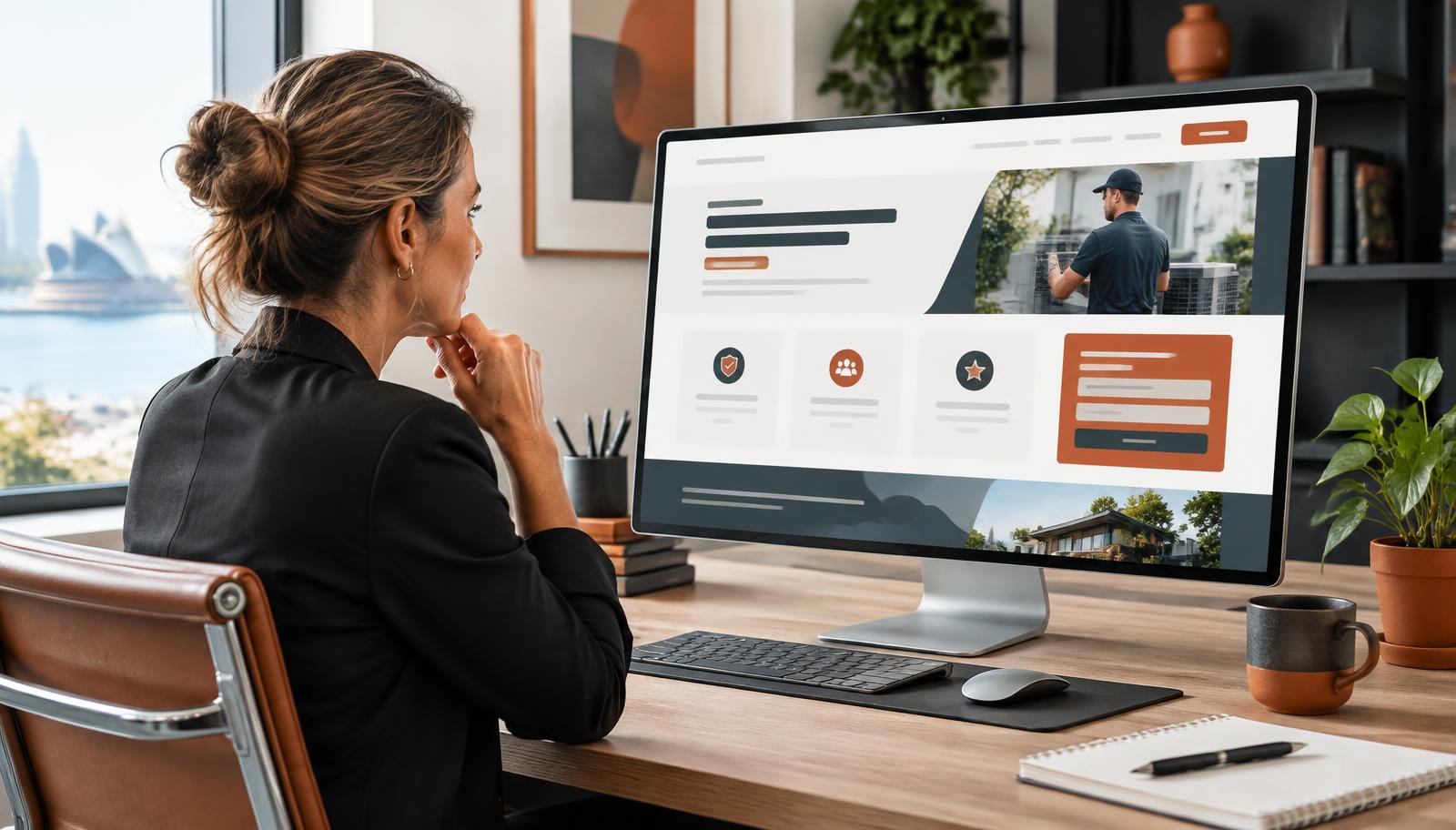
Looking Good Isn't the Same as Working Well
It's easy to judge a website by whether it looks modern — clean layout, nice photography, a bit of animation. But visual polish and persuasive clarity are two different things, and plenty of attractive websites quietly fail at the second one. If you've ever wondered why your website gets traffic but no enquiries, a missing answer to "why choose us" is one of the most common culprits.
The Question Every Visitor Is Silently Asking
When someone lands on your site, they're not evaluating your font choices. They're asking, often without realising it: is this the right business for my problem, and why should I trust them over the other tabs I have open? If your homepage doesn't answer that clearly within the first screen or two, most visitors will leave rather than dig for the answer.
Common Ways Websites Fail to Answer It
Generic headlines
"Quality Service You Can Trust" or "Your Partner in Success" could describe almost any business in any industry. These phrases fill space without communicating anything specific, and they're a symptom of missing brand strategy work.
Feature lists without context
Listing what you do ("Plumbing, gas fitting, hot water systems") without explaining who it's for or what makes your approach different leaves visitors to do the comparison work themselves — and most won't bother.
No differentiation from competitors
If a competitor could copy your homepage word for word and it would still make sense for their business, you haven't actually said anything unique yet.
Style overriding substance
A beautifully designed site with vague copy is like a well-dressed person who can't explain what they do for a living — memorable for the wrong reasons.
What a Website Should Communicate Early
Regardless of industry, most SME websites need to answer, within the first 30 seconds, who they help, what problem they solve, and why this business specifically. We go into this in more detail in the 5 things every service business website should communicate in the first 30 seconds.
A useful test: cover your logo and read your homepage headline and subheading aloud. If it doesn't sound like it could only be written about your business, it needs work.
Practical Fixes You Can Make Without a Redesign
You don't necessarily need a new website to fix this — often it's a copy and structure problem layered on top of a perfectly good design.
- Rewrite your headline around the customer's problem, not your company name or generic claims.
- Add a short "why us" section with 2-3 specific, honest points of difference — not just "experienced and reliable," which everyone claims.
- Include a clear next step near the top of the page, so interested visitors don't have to hunt for how to contact you.
- Check what happens after someone enquires — a strong first impression can be undone by a slow or unclear follow-up, which we cover in what happens after someone fills out your website contact form.
Where This Connects to Brand Voice
Even strong messaging can fall flat if the tone doesn't sound like a real person talking to another person. Working out your brand voice alongside your website copy makes the "why choose us" answer feel authentic rather than like marketing filler.
When to Get Outside Help
If you've tried rewriting your homepage and it still feels generic, that's often a sign the underlying positioning hasn't been nailed down yet — worth revisiting via a proper brand strategy exercise before touching the website again. If the issue is purely structural or technical, our website services team can help rebuild the site around clearer messaging.
If you're not sure whether the issue is your design, your copy or something upstream in your strategy, get in touch — a short conversation is usually enough to work out where to start.
Review the Journey, Not Just the Homepage
Clear positioning needs to continue after the opening headline. Follow a likely visitor path from the homepage to a service page, an about page and the contact form. At every step, check whether the information answers the next reasonable question rather than repeating broad claims.
A conveyancing website, for example, may begin with a clear promise of plain-English support for buyers and sellers. Its service pages should then explain what is included, where human judgement is involved and what a client can expect after making contact. If the next page switches to dense terminology or gives no indication of process, the initial clarity is lost.
Mobile review is essential. Read the page on a phone and look for oversized headings that push the explanation below the screen, buttons with vague labels, long paragraphs and contact details that are difficult to use. Then ask someone unfamiliar with the business to complete one task, such as finding the right service and making an enquiry. Their questions are often more useful than another round of visual polishing because they reveal where the message or path is unclear.